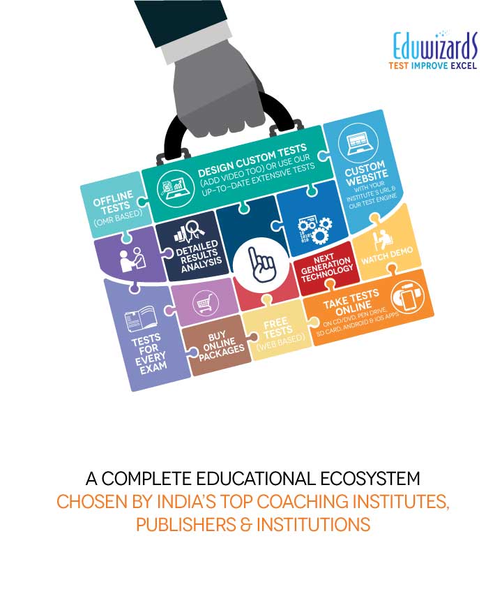
EDUWIZARDS WANTED THEIR COMPREHENSIVE ONLINE EDUCATIONAL ECOSYSTEM TO BE OVERHAULED. WE COMPLETELY REIMAGINED AND REFRESHED THEIR WEB PRESENCE.
The process involved a steep learning curve about the way Eduwizards operated in India and in the US. We literally learnt their business, and then developed their online presence for India. A massive website was re-strategised and re-designed. A new look was developed and expanded into all of their web assets. The result was a vastly improved design and a much more intuitive web experience for all their clients, students, tutors and stakeholders.
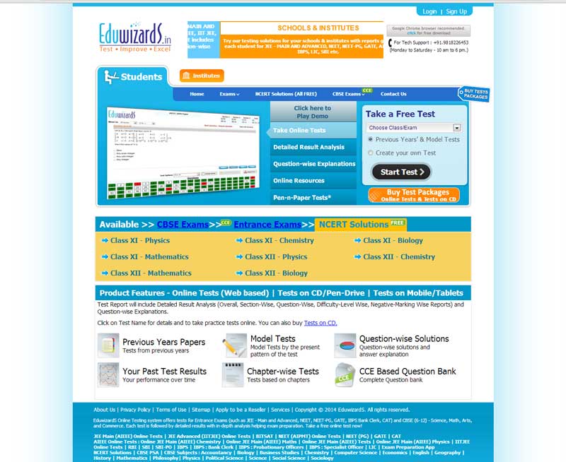
Initially they had a very basic website that looked like this:
We reimagined and re-strategised it according to their new plans for online tutoring and home tutoring:
You can have a look at the live website here – https://www.eduwizards.com/india/index.php
We also created a style guide for them to create new assets and maintain a uniform look and feel for all of their marketing assets.
We also developed marketing collateral.
We went on to develop several tactical websites for them too.

As a part of the campaign we helped with their launch of social media by creating a series of Facebook posts and posts for other social media sites. The first phase talked about their stature and announced the launch.
The second phase put forth the advantages of Eduwizards for students.
The third phase was about bringing in more engagement with the Facebook page.
There were some tactical creatives too.


